Introducing the enhanced 1Password Inline Menu. This powerful feature enables seamless integration between 1Password and any web page, allowing users to effortlessly fill in their information directly into forms. As the most utilized feature by our dedicated user base, we embarked on a mission to elevate the inline menu to become best-in-class.
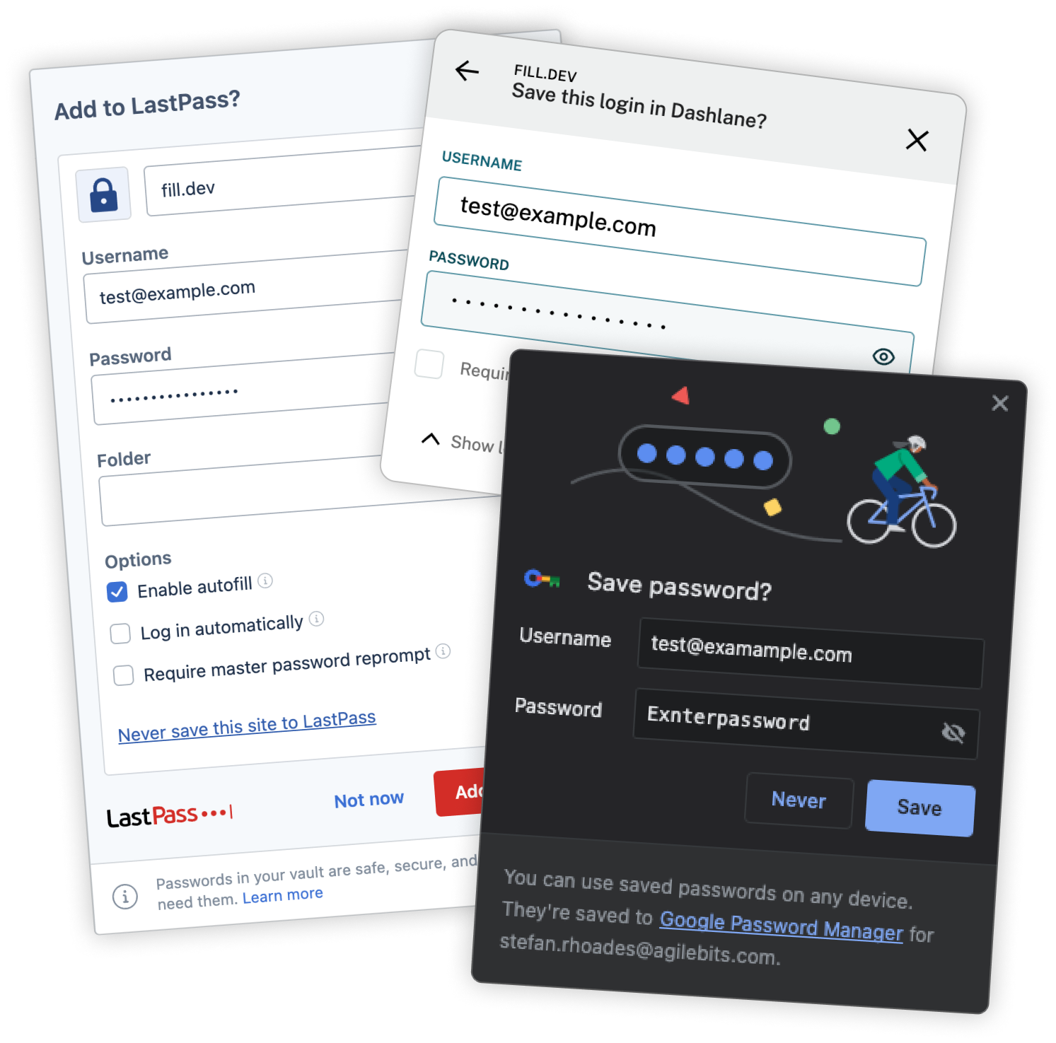
While our primary emphasis was placed on our in-built managers, we also extended our search and evaluation to encompass five additional third-party products.
Leading up to this project, we asked our users for their general thoughts on the inline menu. What’s working, what isn’t and what do they want to see:
The existing 1Password save dialog is outdated and utilizes deprecated components, resulting in a subpar user experience. With 1Password’s recent upgrade to a centralized design system, it is essential to modernize and align the browser's save dialog with the new available components. There is also a need to optimize and enhance the saving and updating process, ensuring its an easier and simpler experience for our users.
The vision is to provide users with an enhanced and intuitive experience when saving and updating information. The new dialog will leverage modern components and functionalities, streamlining the process and making it effortless for users to save and update their data. By improving usability and simplicity, we aim to maximize user satisfaction and productivity, ensuring 1Password remains a trusted and efficient tool for managing personal information.
Our current version excels in simplifying the saving and updating processes. However, this limited functionality can lead to user confusion when they attempt to perform other tasks within the system.
The primary design challenge we tackled in this project revolved around effectively presenting information within the save dialog. Our goal was to provide users with a clear visualization of the changes and updates to their data. It presented a valuable opportunity to incorporate design elements from our established design system. In the project's early phases, we explored various iterations, experimenting with multiple versions to arrive at an optimal solution that would address this key concern.
Throughout this project cycle, we only had time for one official user test. Other upcoming features relied on the completion of this, so we launched into beta for an extended period. This gave us time for our user base to try the feature out and report any potential usability issues.
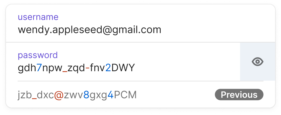
After 4 weeks we correlated the results and the only outlier was some behaviors with the reveal password functionality. The user reported that reveal was only reveling the old password and not the new one they had just created. The spec called for both passwords to be revealed (like the user had requested) so a change was implemented.

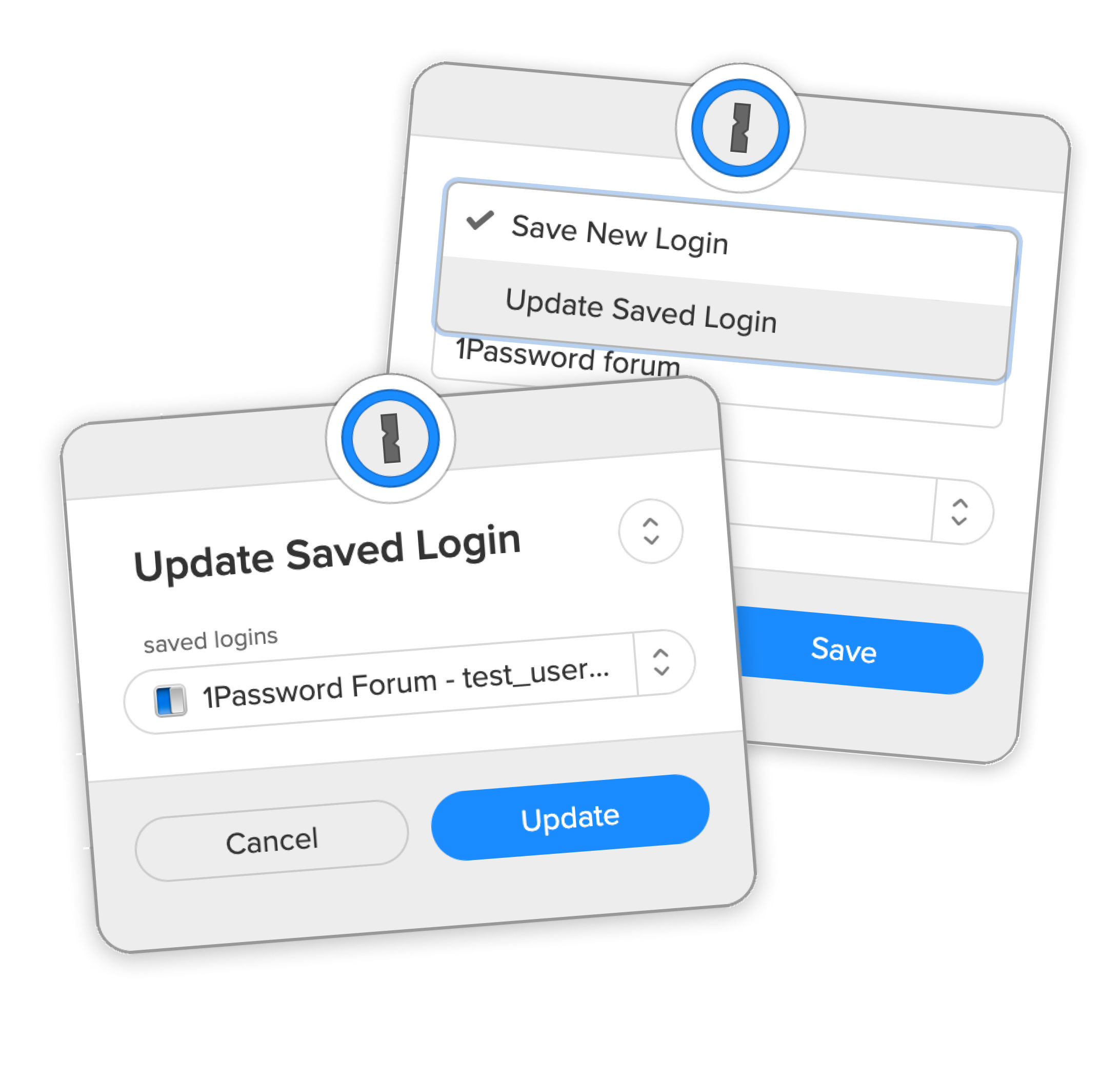
The B5X brain is able to detect when a user is updating a login. When it does, we automatically change the view to update rather than a new save. However, sometimes the logic gets it wrong, or the user just wants the other option. In the old version the update was hidden in a drop down menu. Now the action is visible at all times.
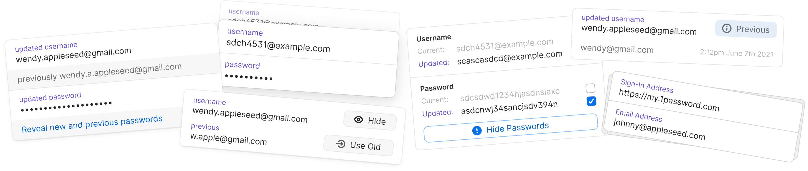
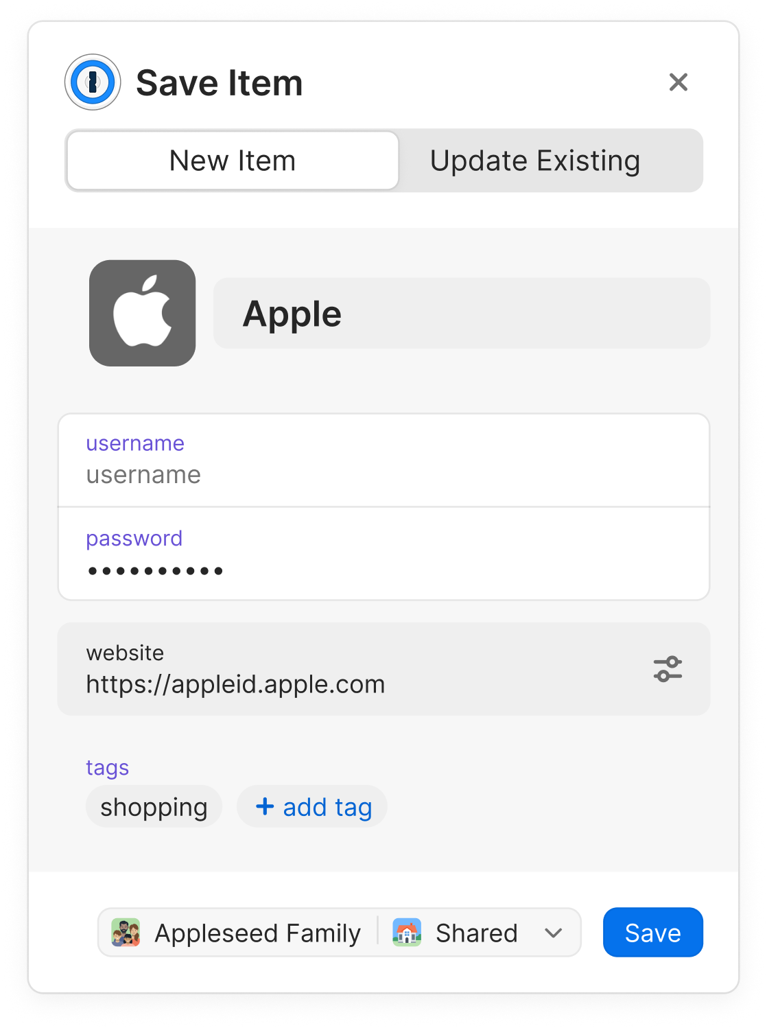
Our objective was to seamlessly integrate the UI, ensuring it felt like a natural extension of the item view, rather than a distinct experience. To achieve this, we introduced an additional row component tailored to showcase the previous value.
By incorporating this component into our design system, we could seamlessly revert to the established primary details UI while seamlessly appending this row when changes in details were detected. This approach allowed for a more cohesive and unified user experience.
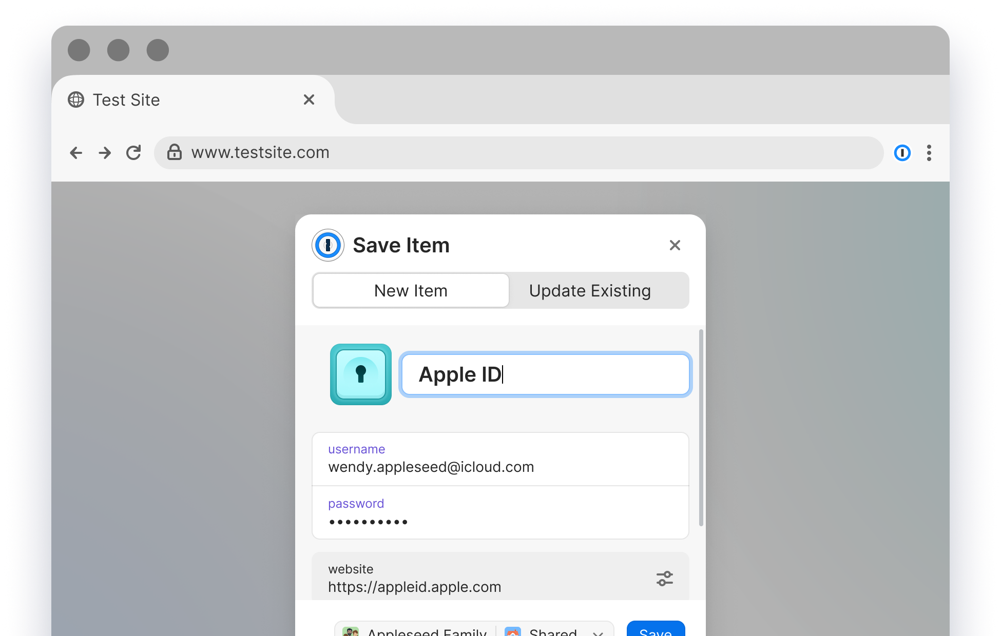
One of the main problems with the old UI was that, users were frequently missing the update item option. It was nested within the option to change the items location. We wanted to test breaking up the action and giving it a more prominent place within the dialogs UI.
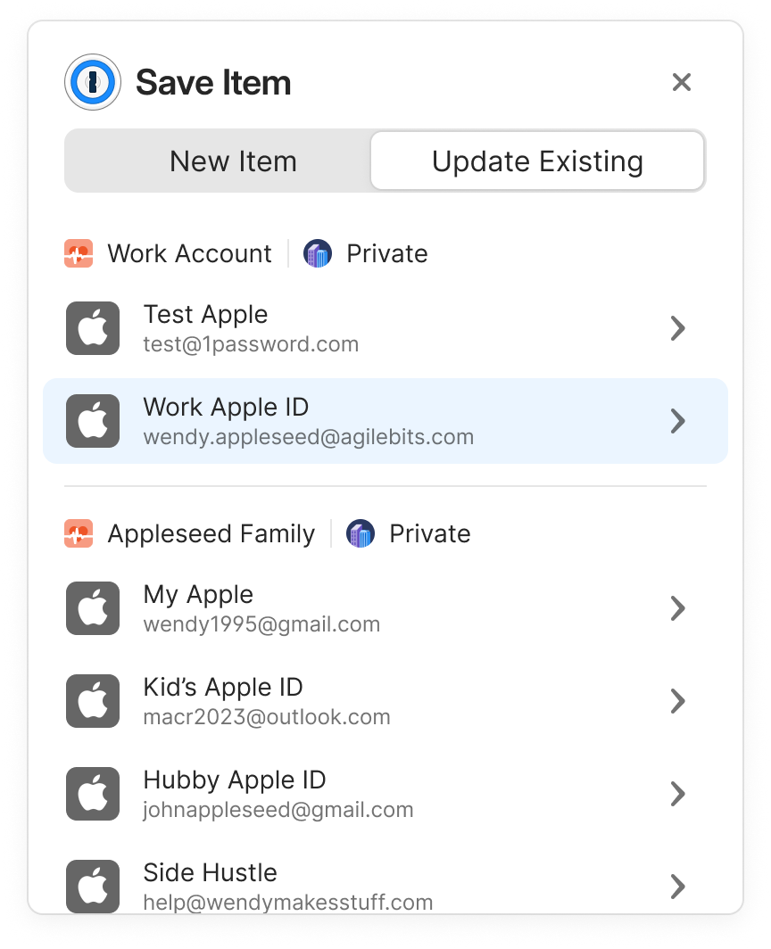
In the earlier iteration of this feature, when there were multiple items with the potential for updates, they were all listed within the dropdown.
However, this dropdown merely displayed the item names, leaving users with limited context to make the right selection. In this updated version, we've enhanced the dropdown by including crucial information: the account in which the item resides, its name, and the saved username or email. This comprehensive information empowers users to make precise selections when updating items, significantly reducing the chances of any inadvertent errors during the saving process.
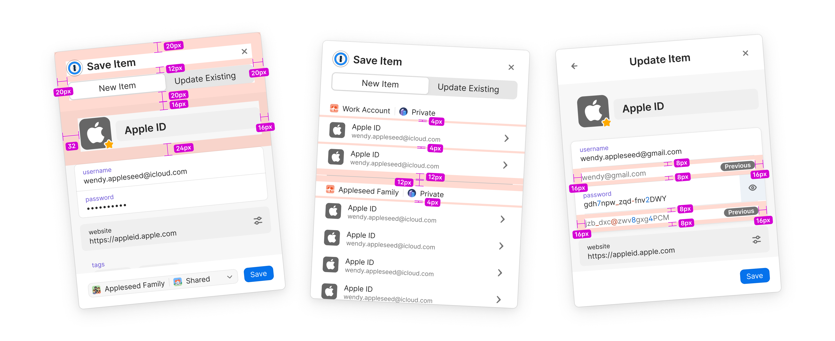
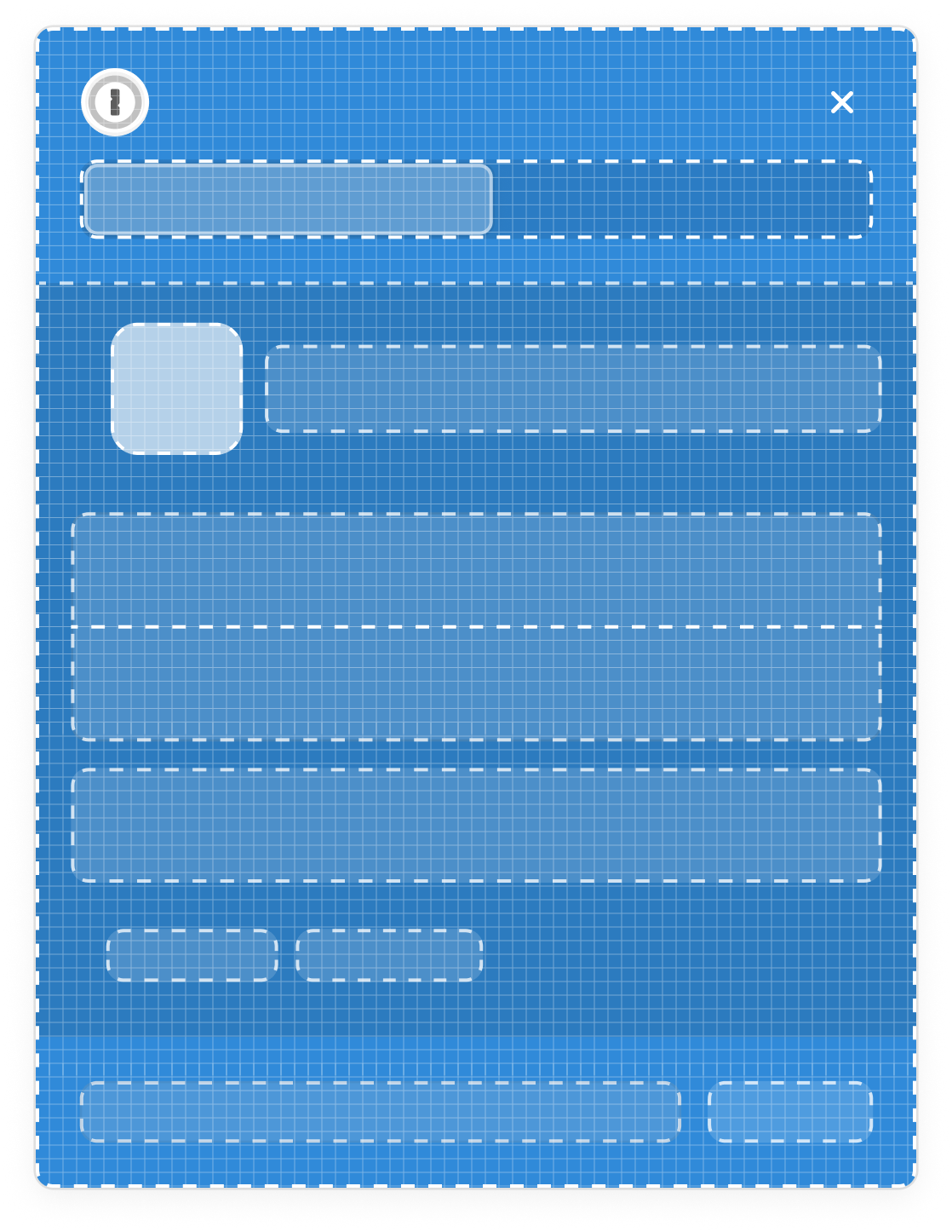
To make developer hand off easier, we put together a full design spec that outlines the changes we made. Spacing was partially important during this project, we refined the layout to get as much use out of our limited space as possible.
Sometimes our users they don’t want to interact with with the inline menu. To solve this currently, our users have to use the right click context menu to hide the inline menu on the specific page they are on. Alternatively they can navigate to their B5X settings view and blanket turn the feature off. Both current solutions are clunky & not discoverable.
This feature is currently on our 2024 road map. More details of its release are
This feature is currently on our 2024 road map. More details of its release are
