Browser Extension V2

One of my initial projects upon joining the browser team involved revamping our extensions interface. Just prior to this, we had launched 1Password 8, which marked the introduction of our very first design system, 'Knox.' As efforts were underway to align our mobile clients with this design system, it became equally imperative to unify and harmonize our browser experience. This project also aligned with apples release for extensions on safari.

Before

Nav Bar

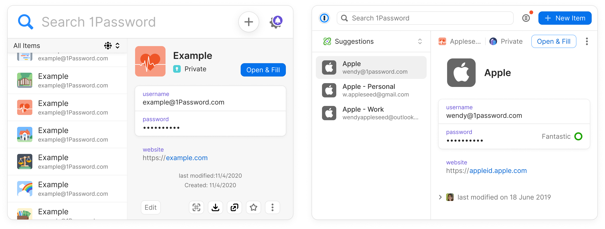
The Navigation Bar serves as the central hub for user interaction within 1Password, primarily catering to their navigational needs. Extensive research has confirmed that search functionality is the predominant method employed by our users for navigation. Additionally, this essential component houses both the settings/notification view and the create item action, offering users a holistic control center.

Areas for improvement

  • The current design of the Navigation Bar is considerably tall, occupying more screen real estate than necessary, potentially leading to reduced content visibility.
  • The text size within the Navigation Bar is disproportionately large, which could be visually overwhelming and may contribute to a cluttered appearance.
  • The 'New Item' action represented by an icon lacks clarity and may confuse users as it doesn't adequately convey its purpose.
  • The amalgamation of settings and notifications within the same navigation component may result in an unconventional and potentially confusing user experience, warranting a more intuitive separation of these functions.

Secure Password generator

The Secure Password Generator is presented as a side sheet, offering users a convenient and customizable tool for crafting and copying secure passwords. It primarily serves as an alternative solution for use cases where our inline functionality may not fully meet user needs. This component's primary function is to enhance password security.

Areas for improvement

  • The Secure Password Generator's design elements and styling are outdated, potentially leading to an inconsistent visual experience and misalignment with the current design standards.
  • The absence of a clear title within this component could create confusion for users, hindering their understanding of its purpose.
  • The history section, when opened, redirects users to a new tab, leading them to a different area of the app. This behavior may disrupt user flow and be considered counterintuitive, requiring improved navigation within the component.

Item details

The Item Detail View serves as the pivotal container responsible for housing and presenting comprehensive information pertaining to a 1Password item. Typically, it includes vital data such as email and password for logins or credit card details and payment method specifics. This view aims to offer users an in-depth overview of their stored items.

Areas for improvement

  • The Item Detail View incorporates design components from a prior 1Password style, which may result in visual inconsistencies and misalignment with the current design standards.
  • This component fails to clearly indicate where the item is located within the user's account structure, potentially causing confusion and making it challenging to differentiate similar items.
  • Positioned at the bottom of the component, the array of action buttons occupies valuable screen real estate, even though many of these actions are infrequently used. This can lead to clutter and a less efficient user experience.

    Item List

    The Item List is positioned on the left-hand side of the screen, just below the Navigation Bar. It functions as a comprehensive list that showcases results from the search function and presents items associated with the current domain the user is on. This component plays a crucial role in helping users locate and manage their stored information effectively.

    Areas for improvement

    • The Item List features an outdated user interface that may result in visual disparities and misalignment with the current design standards, potentially affecting the overall user experience.
    • Upon loading, the default behavior is to display all items, which might overwhelm users by presenting a large volume of information upfront. This could lead to confusion and hinder efficient item retrieval. Implementing more relevant default filters or options could enhance usability and help users focus on what matters most in their current context.

    After

    Nav Bar

    Changes made

    • Reduced font size for a cleaner and more efficient design.
    • Introduced an account/vault switcher on the left-hand side, enhancing item filtering and user control.
    • Added text to the 'New Item' button to provide clear context and improve user understanding.
    • Implemented a menu button, ensuring dedicated sections for notifications, the secure password generator, and settings, leading to improved organization and accessibility.

    Secure Password generator

    Changes made

    • Maintained a consistent UI design with the desktop app to ensure a seamless and uniform experience for users.
    • Implemented pointer and touch-friendly form controls for various inputs, enhancing accessibility and usability across different devices.
    • Redesigned the history section to enhance user-friendliness and facilitate easy navigation of password generator history, ensuring users can effortlessly manage and access their generated passwords.

    Item details

    Changes made

    • Adopted a simplified and consistent UI design, aligning it with the desktop app for a uniform user experience across devices.

    Item List

    Changes made

    • Maintained a consistent UI design with the desktop app to ensure a seamless and uniform experience for users.
    • Default behavior to smart suggestions reveal only items that match the domain
    Previous
    Next