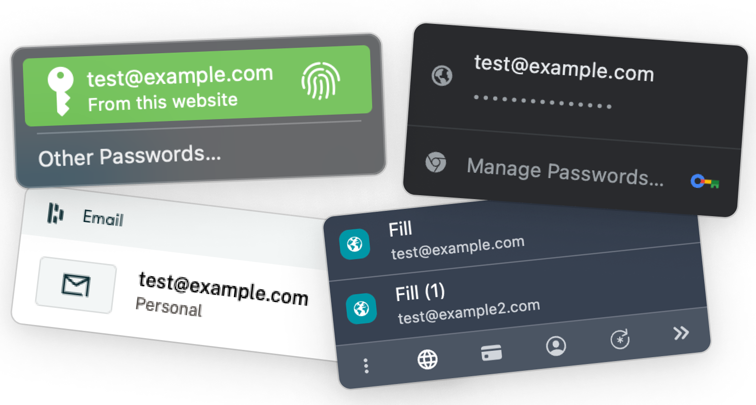
Introducing the enhanced 1Password Inline Menu. This powerful feature enables seamless integration between 1Password and any web page, allowing users to effortlessly fill in their information directly into forms. As the most utilized feature by our dedicated user base, we embarked on a mission to elevate the inline menu to become best-in-class.
During discovery, 9 products were tested & analyzed. The goal was to use our company goals as a baseline, and compare how other password managers match up to ourselves. We arrived at 4 outcomes:
Over the years, the inline menu has undergone several iterations, consistently driven by the primary objective of minimizing cognitive strain and ultimately enhancing the user experience by making it more straightforward and efficient.
Our filling and saving experience is falling short for our users when it comes to reliability, and in turn, efficiency. We don’t always show up where they need to save and fill, and we don’t always have the right answers when we do — leaving users feeling frustrated and unproductive.
A filling and saving experience that maximizes users’ productivity, enabling them to add new items seamlessly & fill quickly. We’ll meet users wherever they are with reliable, simple and smart filling that enhances their productivity — balanced with giving them control to make 1Password work for them the way they want.
Leading up to this project, we asked our users for their general thoughts on the inline menu. What’s working, what isn’t and what do they want to see:
In the project's initial phases, we explored various directions. Our interactions with customer support revealed a recurring issue: the inline menu lacked branding and clear recognition, causing user confusion when distinguishing conflicting managers. Yet, after some initial design attempts, we concluded that this feature added unnecessary complexity to the UI and wasn't essential.
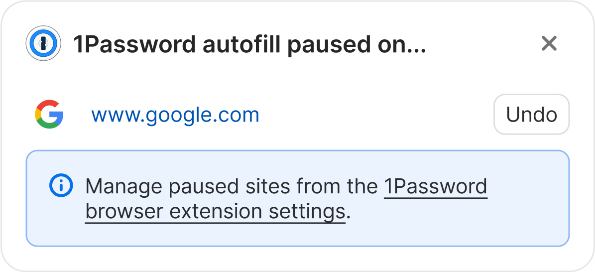
In certain situations, our users prefer not to engage with the inline menu. Presently, to address this issue, users must resort to either utilizing the in-page context menu to hide the inline menu on the specific page they are visiting or navigating to the settings page to disable the entire feature. However, both of these existing solutions are cumbersome and lack discoverability. How does this new solution fare in comparison?

A major challenge confronting our users revolves around the intrusive nature of the inline menus. Consequently, our Customer Support team receives a substantial volume of tickets related to this matter.
Presently, their recommended solution involves guiding users to access the settings and disable the entire feature. This icon change is suggestive and invokes the possibility that it might be interactive and could trigger an action upon clicking.
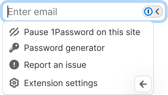
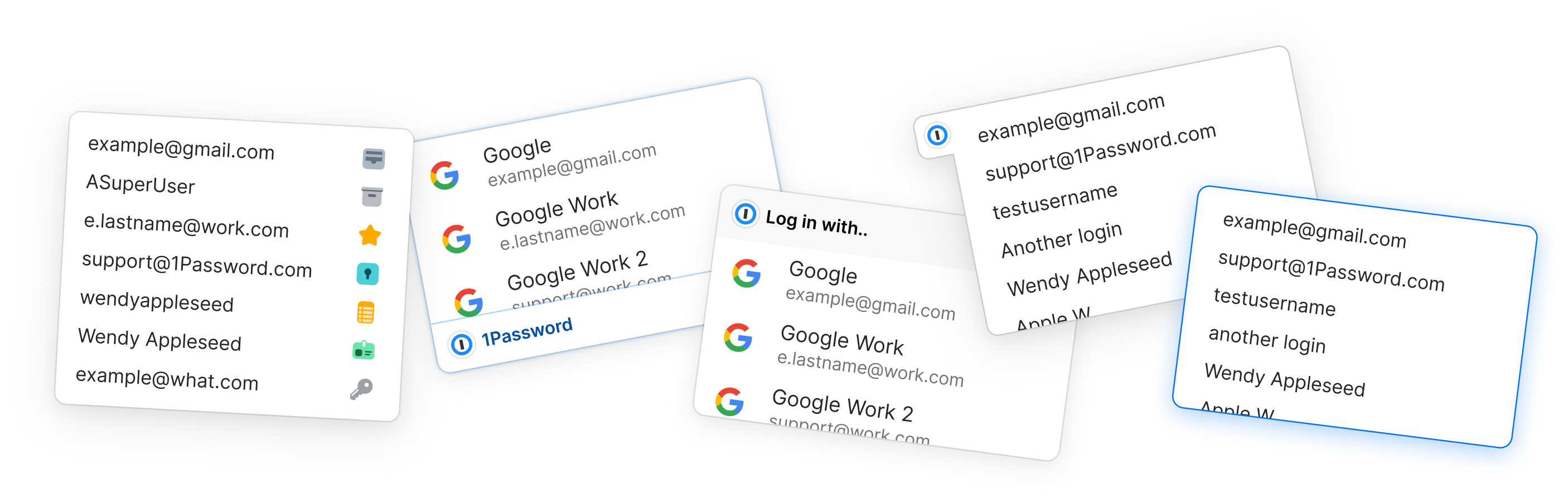
Our users expressed a need for additional features within the inline menu, requiring us to find an appropriate space for them within the user interface. The sub-menu emerged as the optimal choice, providing a location with minimal visual interference.
Our primary objective was to introduce these options seamlessly, ensuring they enhance the user experience without detracting from the user's primary task of filling and saving with 1Password.
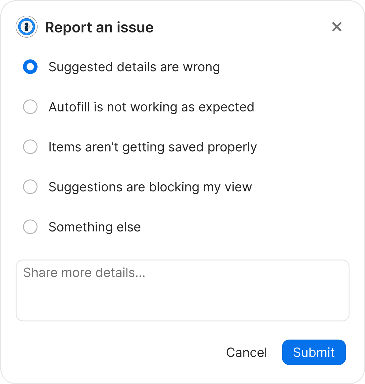
Occasionally, 1Password's suggestion feature may misfire, leading users to seek assistance from our support staff as their sole recourse. This can be a significant endeavor for users, demanding commitment on their part and also placing added strain on our support team, consequently escalating our workload. Users need a self-service avenue to report and resolve these issues. How does this proposed solution align with our users' needs and preferences?
Our previous empty state design proved to be unhelpful and lacked utility. It simply opened the inline menu and displayed the message "no items found."
We are now transitioning to a tooltip feature to enhance user assistance without being intrusive. Additionally, we have revised the copy to take responsibility for the issue, shifting the blame away from the user.
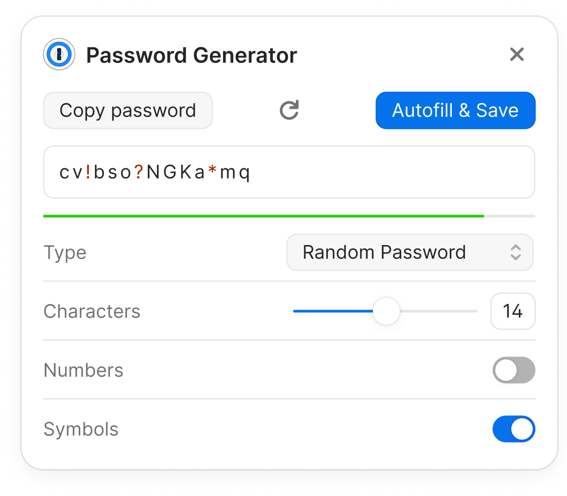
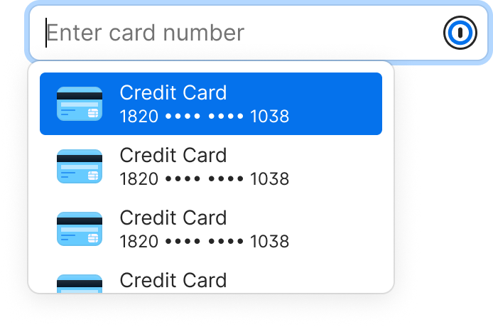
Research indicates that a significant majority of our users tend to avoid opening the pop-up, which poses a challenge when it comes to creating secure passwords, as the interface primarily resides within it. In response, we aimed to provide our users with an alternative route to access the password generator, especially for those who prefer not to rely on the suggested inline password prompt. This adjustment also addresses issues related to password errors when the suggested password doesn't align with a website's specific requirements.
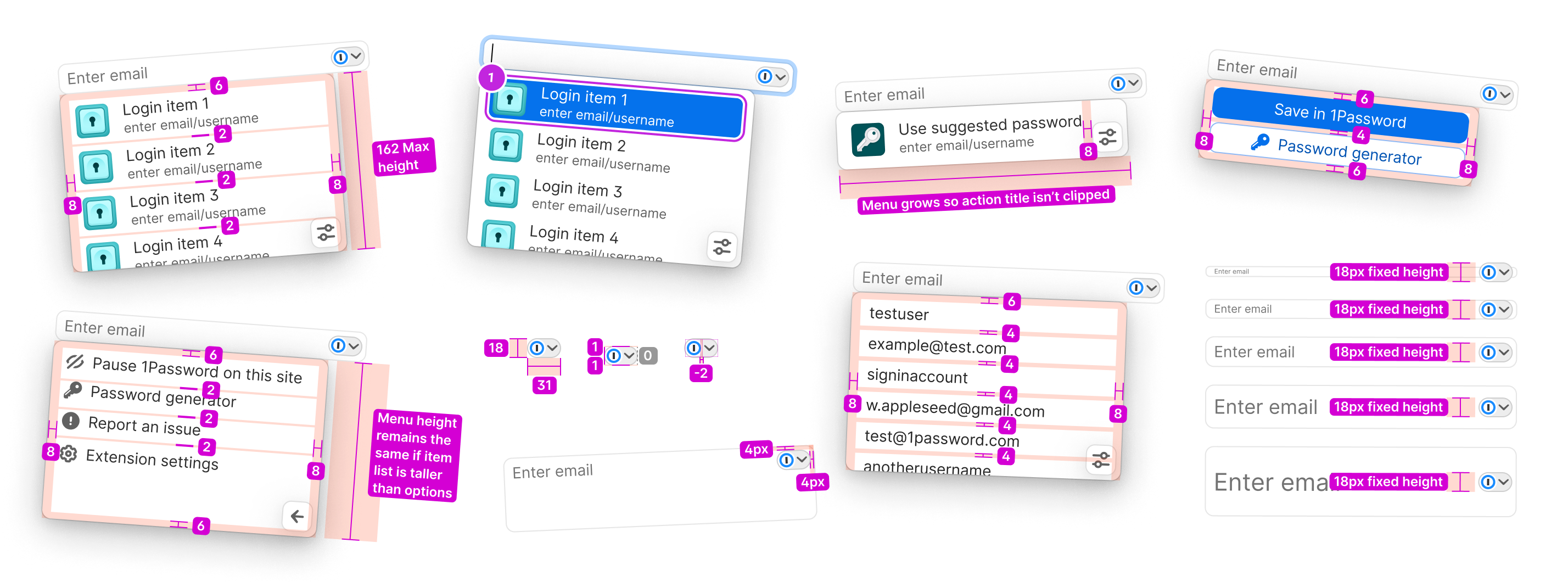
To streamline the developer hand-off process, we've compiled a comprehensive design specification that meticulously details the modifications we've implemented. Throughout this project, careful attention was paid to spacing considerations, as optimizing layout within our constrained space was a key priority.
The practice of documenting and offering thorough user flows serves as an invaluable method for recording design decisions. These user flows serve as a valuable resource for developers, designers, and product professionals seeking to gain a deep understanding of the intricate workings of upcoming features.
This feature is currently on our 2024 road map.
More details upcoming.
