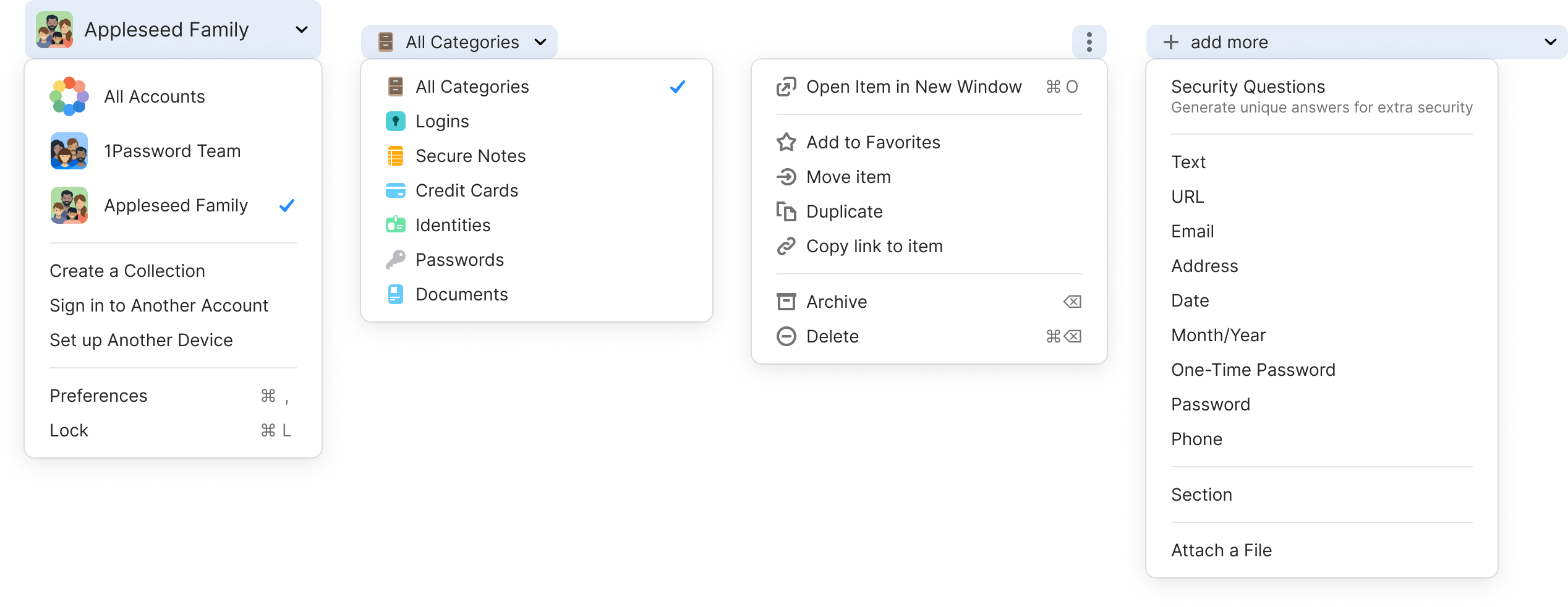
In the inaugural version of Knox, every designer at 1Password made their contributions to the design system. Here are the components that I crafted.
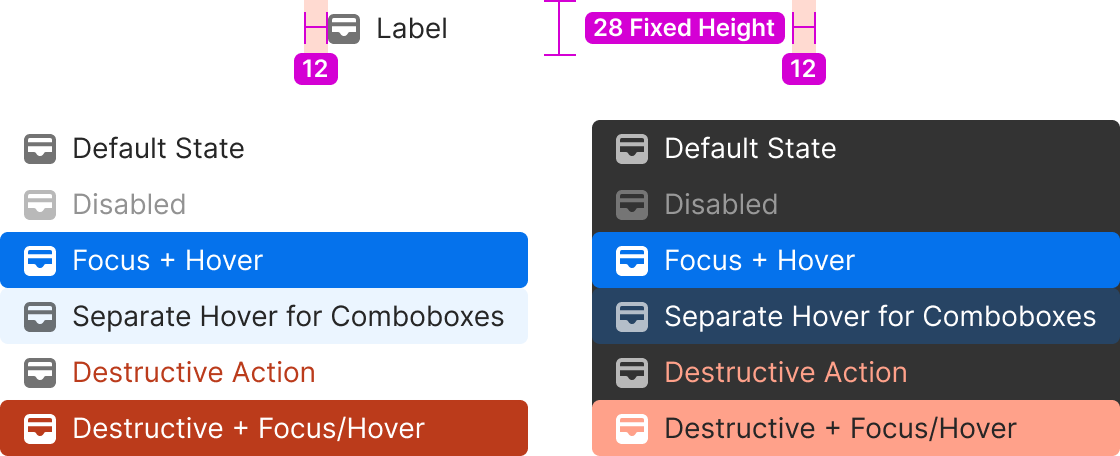
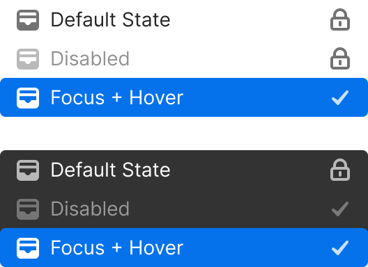
Because comboboxes are primarily keyboard driven (text fields combined with menus below that filter or autocomplete), we have found that having the focus and hover state be the same can lead to accidental selection of the wrong item when a hand brushes against a trackpad while typing. So in that use case, menus gain a separate hover state leaving the focus state for keyboard use.
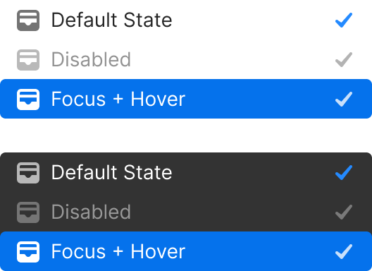
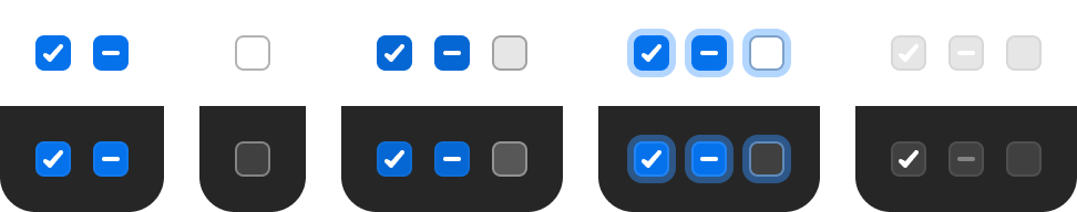
Checkmarks are used to indicate the currently selected option in a menu with multiple selectable options
Checkmarks are used to indicate the currently selected option in a menu with multiple selectable options
By default – Display directly below the triggering button with no space between.If menu height extends beyond the bottom of the parent container, and there’s room to display above – Display directly above the triggering button/field, with no space between.
By default – left align with trigger button.If the menu width would extend beyond the window, and there’s room to display on the left – right align with the button.If there isn't room to display when right or left aligned – Align to the edge of parent container closest to the button.For right to left languages, the alignment rules above should be reversed.
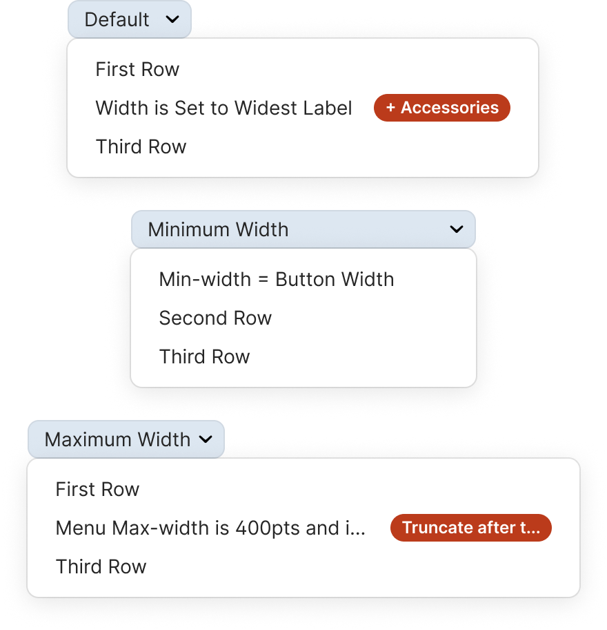
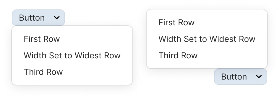
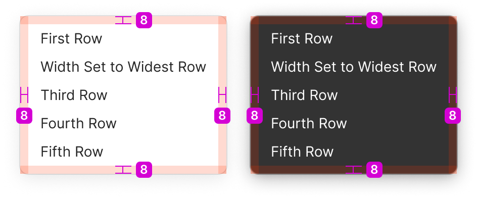
The default width of a menu is set by the row with the widest row including it’s Text + Icon label and any accessories shown. Set the minimum width to the button that the menu is attached to.This rule can be broken in extreme circumstances. Full width buttons in a very wide view for example. The maximum width of the menu container is 400pts or the width of the window it’s in (whichever is smaller). The accessory max width is 120pts. Both the accessory text and the Icon + Text Label’s text should truncate if it goes beyond the space available.
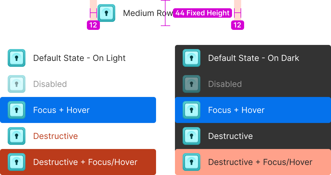
Medium rows are the default when the primary input is touch based. They can also be used for when you want to display a larger set of icons like in the Account/Collection menu.
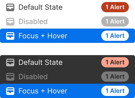
In some situations where a menu row really needs additional information, the secondary label of the Text+Icon Label can be used. Use it with caution as only web based platforms with custom menus can display it, and it can greatly reduce scannability of a menu.
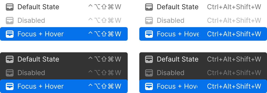
Shortcuts are displayed as symbols. Modifier keys are set to 14pts wide and single character trigger keys are set to 16pts to keep them aligned vertically from one row to the next as well.
Modifier keys are always displayed in this order:
⌃ control
⌥ option (same as alt)
⇧ shift
⌘ command
Some word based trigger keys display as symbols as well:
↩ return/enter
⌫ delete
⇥ tab
⎋ escape
The only key that does not display as a single character on macOS is “Space”ex: Quick Access = ⇧⌘Space
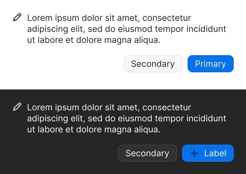
Medium elevation
8pt rounded corners
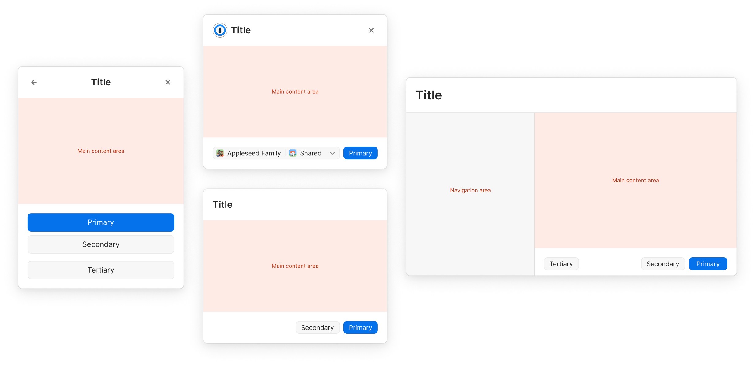
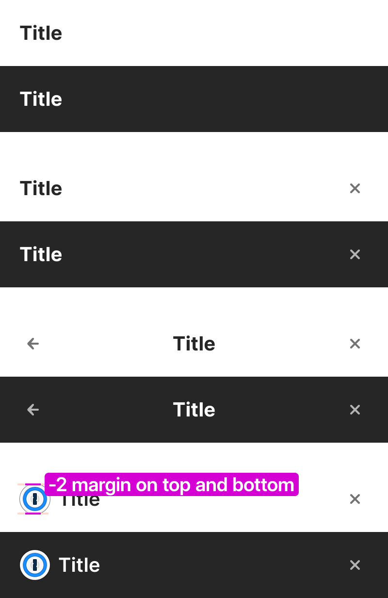
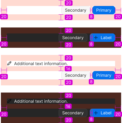
Content within the content area, as well as the buttons, should shrink and truncate appropriately in order to avoid severe degradation of the interface. A modal is vertically and horizontally centered within the window or viewport in which it is placed.
Checkmarks are used to indicate the currently selected option in a menu with multiple selectable options
By default – Display directly below the triggering button with no space between.If menu height extends beyond the bottom of the parent container, and there’s room to display above – Display directly above the triggering button/field, with no space between.
By default – left align with trigger button.If the menu width would extend beyond the window, and there’s room to display on the left – right align with the button.If there isn't room to display when right or left aligned – Align to the edge of parent container closest to the button.For right to left languages, the alignment rules above should be reversed.
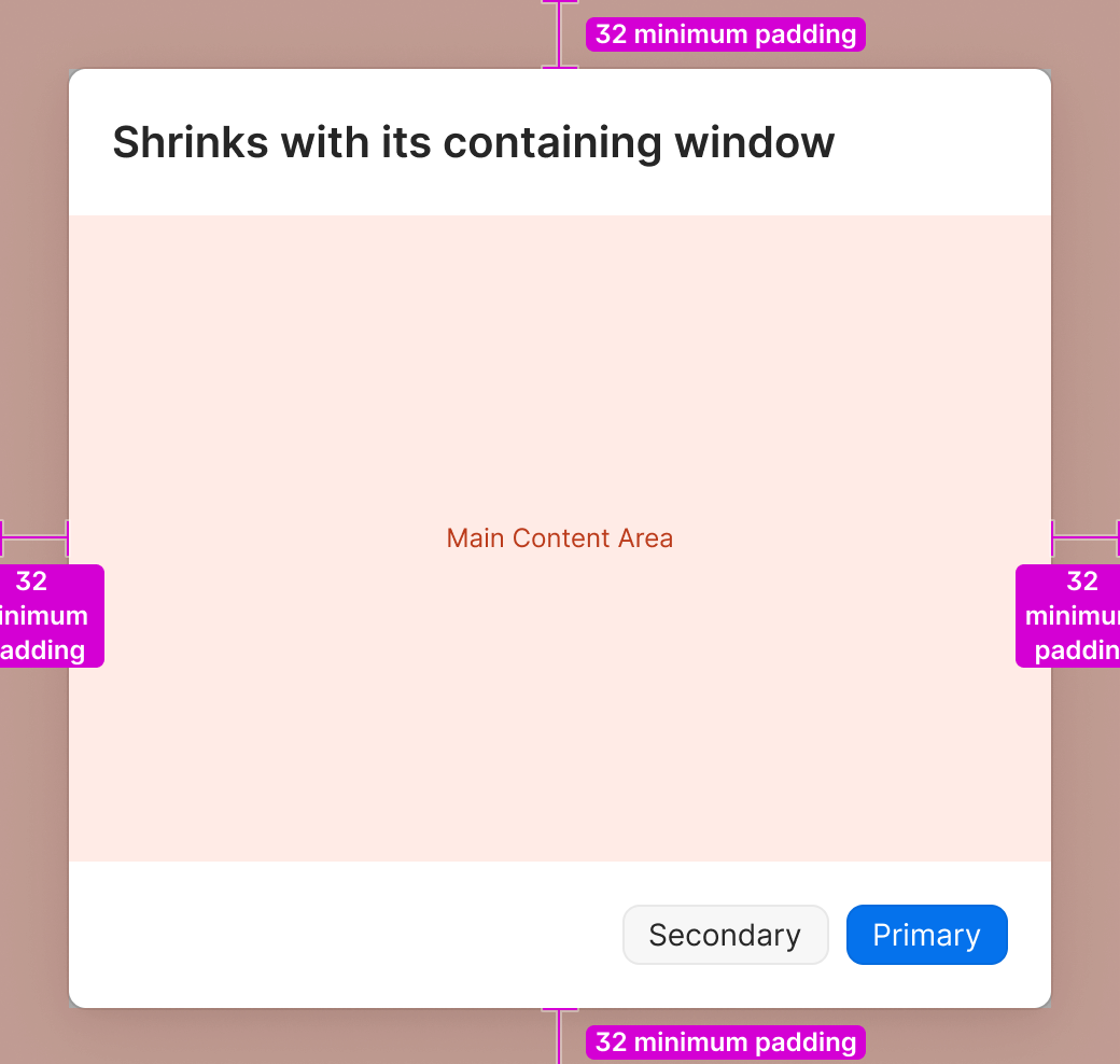
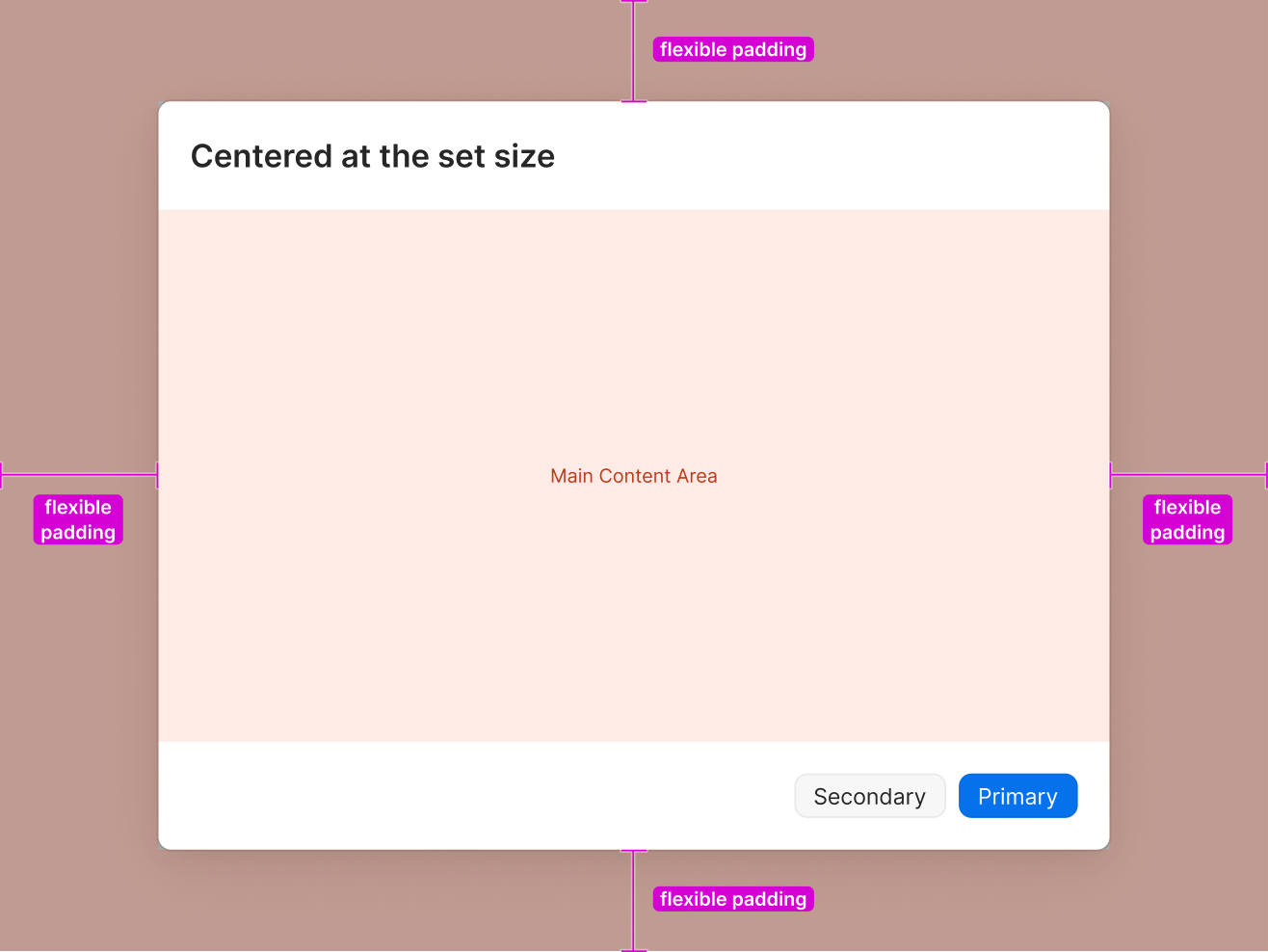
If the window or viewport in which the modal is placed becomes smaller than the set size of the modal, the modal will shrink to fit with a minimum amount of padding. In that case, the content within the modal will need to scroll.
Shortcuts are displayed as symbols. Modifier keys are set to 14pts wide and single character trigger keys are set to 16pts to keep them aligned vertically from one row to the next as well.
Modifier keys are always displayed in this order:
⌃ control
⌥ option (same as alt)
⇧ shift
⌘ command
Some word based trigger keys display as symbols as well:
↩ return/enter
⌫ delete
⇥ tab
⎋ escape
The only key that does not display as a single character on macOS is “Space”ex: Quick Access = ⇧⌘Space
Medium elevation
8pt rounded corners
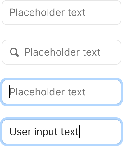
Horizontally resizable
With or without a leading icon
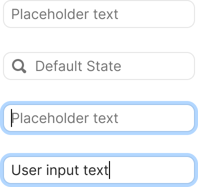
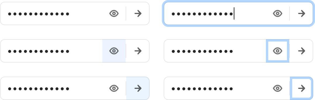
With or without blinking caret for use in mockups and Figma prototypes.
Horizontally resizable, with or without icon, and with or without blinking caret. The Header Small text style can also be used for these fields when used as an editable Header/Title field.
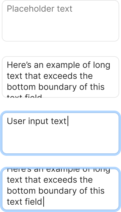
Horizontally or vertically resizable
With or without blinking caret for use in mockups and Figma prototypes
Multi-line text fields can’t have icons.
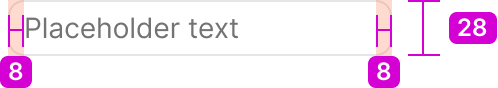
28pt fixed height
8pts of padding on the left + right
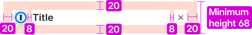
68pt default fixed height
Should not expand if height exceeds bounday
8pts of padding on the left, right5pts of padding on top (to align text with single line text field)
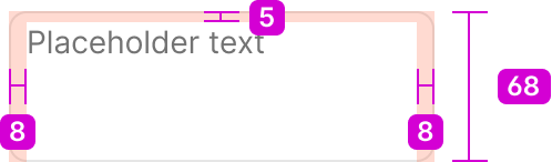
68pt default fixed height
Should not expand if height exceeds bounday
8pts of padding on the left, right5pts of padding on top (to align text with single line text field)
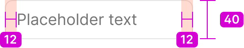
40pts tall
12pts of padding on the left and right
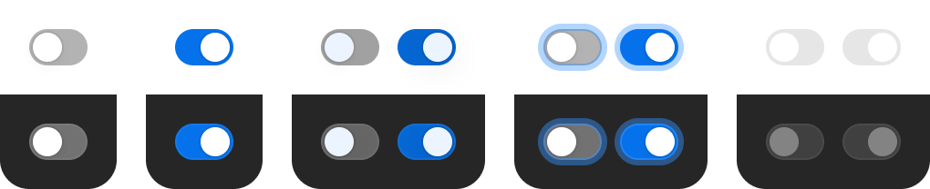
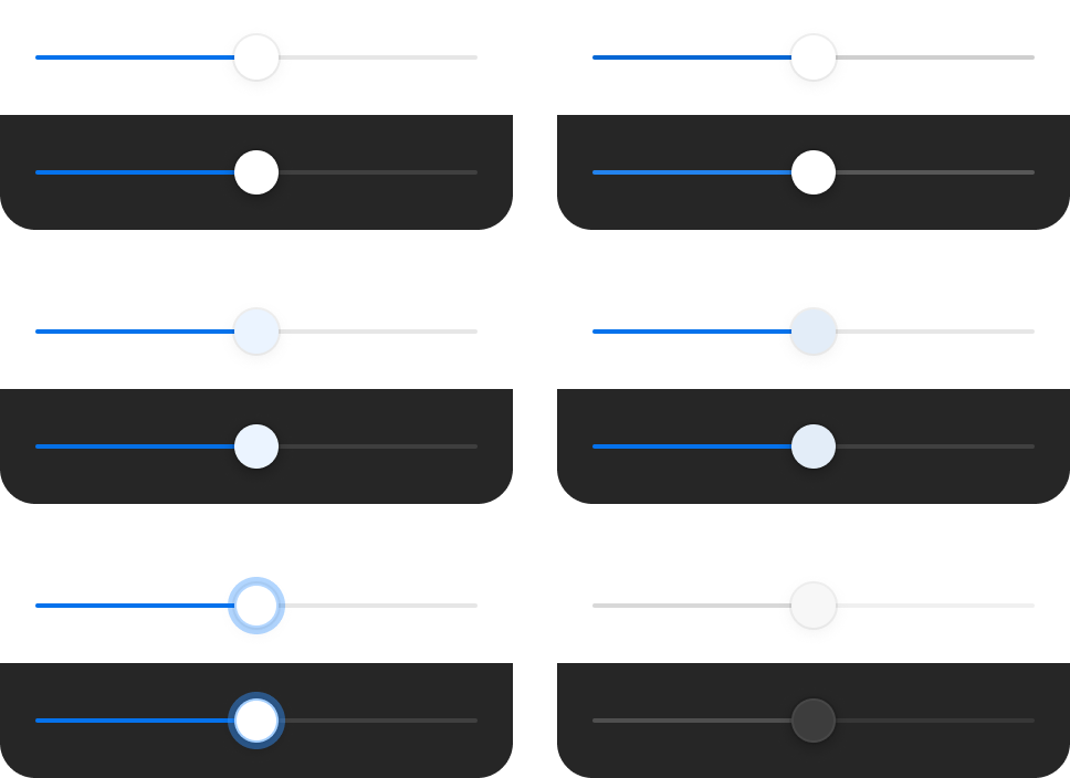
The background color changes between the On Light and On Dark versions of Shading / Medium. The On Dark variant background has an inner 1pt border of Shading / On Dark / Barely There.
Background color changes to Branding / Bits Blue Core in both themes and the thumb animates to the right.
The background gets Shading / On Light / Faint added on top of the background color. The thumb gets Tints / On Light / Blue added on top. Same coloring changes for both themes.
Keyboard focus adds our standard Focus Ring effect around the entire control.
On and Off states use the same coloring and styles when disabled. Backgrounds change to Shading / Faint (On Light or On Dark versions appropriately). On Dark the thumb changes to Shading / On Dark / Medium. Hover does nothing when disabled.
68pt default fixed height
Should not expand if height exceeds bounday
8pts of padding on the left, right5pts of padding on top (to align text with single line text field)
Horizontally resizable
With or without a leading icon
With or without blinking caret for use in mockups and Figma prototypes.
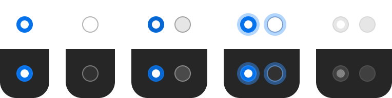
The background color changes between the On Light and On Dark versions of Shading / Medium. The On Dark variant background has an inner 1pt border of Shading / On Dark / Barely There.
Background color changes to Branding / Bits Blue Core in both themes and the thumb animates to the right.
The background gets Shading / On Light / Faint added on top of the background color. The thumb gets Tints / On Light / Blue added on top. Same coloring changes for both themes.
Keyboard focus adds our standard Focus Ring effect around the entire control.
On and Off states use the same coloring and styles when disabled. Backgrounds change to Shading / Faint (On Light or On Dark versions appropriately). On Dark the thumb changes to Shading / On Dark / Medium. Hover does nothing when disabled.
Horizontally resizable, with or without icon, and with or without blinking caret. The Header Small text style can also be used for these fields when used as an editable Header/Title field.
